Dirigible Cloud IDE
Dirigible is a cloud runtime platform that comes with a neat, all-in-one, frustration-free package of devops productivity tools, including a brand new cloud IDE for in-system application development. This blog is a getting-to-know the new cloud IDE.
Meet and greet
A picture's worth a thousand words they say...
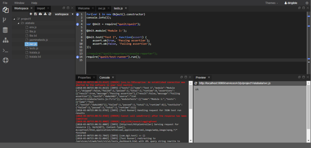
We took our years-long experience in building high-productivity web-based IDE and used it to create a completely new cloud IDE from ground up, using exclusively lean, web-native UI technologies (vanilla JS, JQuery, AngularJS, Twitter Bootstrap) backed by lightweight services.
The new design follows the latest trends in the segment, enriched with some unique flavors, such as interactive work plot personalization (a.k.a. as perspective in Eclipse) to provide a real-world, high-productivity finishing.
Our primary design goals (in short) were to deliver - functionally rich, desktop-like experience (performant, reliable) - highly configurable and interactively composable working area - highly extensible and customizable core - leveraging popular in the community, web-native technologies and frameworks
Building blocks
From end user perspective, the IDE is composition of perspectives, each consisting of the necessary tools to accomplish certain goal. There are three areas with fixed positions: - top-area toolbar for the menus, theme selection and user control; - sidebar to the left, with shortcuts e.g. to the perspectives; - statusbar at the bottom, for notifications and other use by the tools.
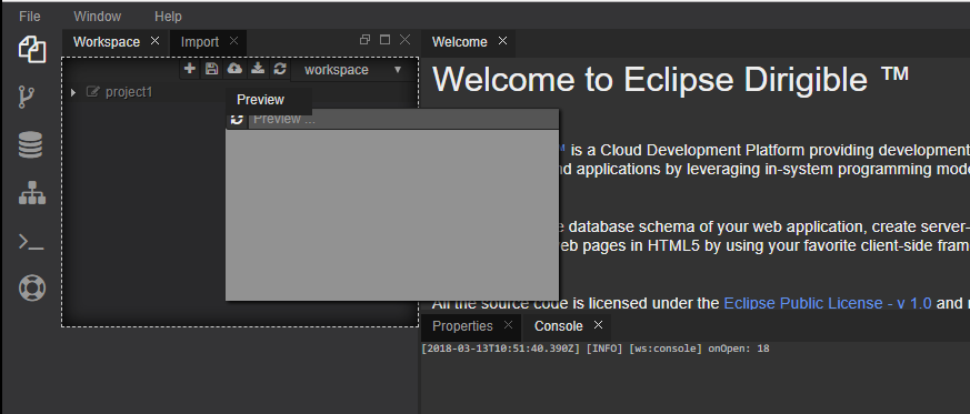
The tools that constitute perspectives are laid out in different (predefined) regions of the work plot, but their position is not fixed and can be changed by dragging it to a new one. The perspectives are simply predefined configurations and end users are free to open, move or close tools on the work plot of a perspective as they see fit. The tools can also be maximized or minimized, even popped out in own window. The tools are the minimal atomic parts in the IDE. They are referred to as views or editors and each type is handled differently.
What's in the box
The IDE package contains the Workbench, Git, Database, Repository and Terminal perspectives. The list is neither limited, nor fixed.
Workbench
The Workbench perspective comprises Workspace, Import, Properties, Console and Preview views, plus the editors registered for each file type. In a word, the minimal toolset for file management, preview and editing operations. A very handy feature is also the template-based project and artifacts scaffolding generators.
New in 3.x
- Multiple workspaces per user. User now can create multiple workspaces and use the Workspace view to manage and switch between them. - Non-normative project file structure. The projects file organization is now non-normative and entirely up-to your preferences. - Multiple editors. The IDE now supports multiple editors registered for different file (MIME) types. More than one editor can be registered for one file type and in this case a "Open with..." context menu entry is rendered for the user to select, which one to use.
Git
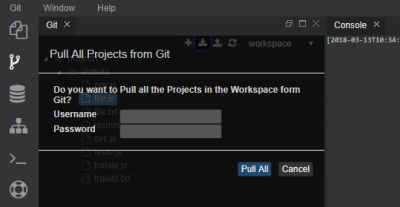
Git perspective is built from tools supporting Git client operations. It doesn't aim to be what EGit is to Eclipse, but rather to present a simplified interface for the most common operations, such as cloning a repository to a workspace, pulling changes, and pushing commits. For more sophisticated command-line interaction see Terminal
Database
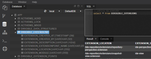
The Database perspective is essential for full stack developers. It features a database explorer, a console to execute SQL statements and preview results in table format.
Repository
The Repository perspective offers explorer for the repository of the Dirigible instance where the IDE is running, and import/export snapshots.
Terminal
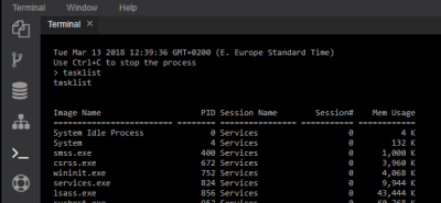
The key view in the perspective is a terminal that emulates console client connected to the environment of the Dirigible IDE that can execute commands.
Editors
The editors that have been integrated are Orion and Ace. More sophisticated and also visual editors are in the pipeline.
Core UI framework
The Core UI framework is an Angular module (ideUiCore) that exposes a number of key components, building the backbone of perspectives and tools in the cloud IDE. Many of these can be further customized and some are part of larger compositions (e.g. the Angular directives for menu, sidebar or statusbar). The design encourages customizations if you are up to some tricky scenario or just rolling out a whole new fully functional perspective with a just a couple lines of code.
To give you the idea how literally true is that, here is a clue:
<body ng-app="workbench" ng-controller="WorkbenchController as wb">

  <div menu menu-data-url="../../js/ide/services/menu.js"></div>
  <div class="shell">
    <div class="sidebar list-group" sidebar active="Workbench"></div>
    <div id="workbench" class="plane" views-layout views-layout-model="wb.layoutModel"></div>
  </div>
  <div class="statusbar" status-bar>{{message}}</div>

</body>
In this HTML template, the directives menu, sidebar, views-layout and statusbar will build a standard perspective layout for you. All you need to add to that (in the corresponding controller) is, which are the views that will be part of the perspective (note the views array property in the layoutModel member below):
...
.controller('WorkbenchController', ['Layouts', function (Layouts){
    this.layoutModel = {
        views: ['workspace', 'import', 'editor', 'properties', 'console', 'preview']
...
}
The components in the core UI framework provide a coherent look and feel for the perspectives and their views and editors in the IDE. A brief description for some of the key components follows.
Message Hub
The IDE building blocks work together in choreography. An action in the Workspace view for example opens-up an editor, or triggers the Preview view to send a request to a service. The communication between the isolated choreography participants is decentralized, and realized by a highly performant, entirely client-side framework - the Message Hub.
The Message Hub is a self-contained (no dependencies) JS library that leverages the HTML5 messaging API to convey messages across the UI component isolation (iframe) boundaries via a simplified, yet highly customizable interface. It works across domains if necessary, yet implementing all best-practices for secure cross-origin client-side communication.
Here is a hint for the simplicity of the API:
A. Load the library
  <script type="text/javascript" src="ui/message-hub.js"></script>
  <!-- and the following for Angular Apps -->
  <script type="text/javascript" src="ui/ui-layout.js"></script>
  <script type="text/javascript" src="ui/ui-core-ng-modules.js"></script>
B. Get an instance
- With vanilla JS
var messageHub = new FramesMessageHub();
angular.module('App', ['ideUiCore'])
...
.controller('SomeController', ['messageHub', function (messageHub){
...
C. Subscirbe for messages of type 'namespace.messageName'
javascript
,  messageHub.on('namespace.messageName', function(message, postEvent){
    //do something...
  });
D. Post a message to subscribers for the 'namespace.messageName' messages
messageHub.send('namespace.messageName', message);
Using the message hub framework, we build highly performant loosely coupled integrations between isolated components, reducing the boilerplate in setting up communication channels to the bare minimum.
Layouts
The cloud IDE layout API delegates the layout management to the GoldenLayout framework – a “multi-window JavaScript layout manager for webapps“, as the author defines it. It handles all the magic of laying things out, stacking, moving interactively, popping out, maximize/minimize, close and open of views and editors.
The angular directive views-layout encapsulates all the complexity of initializing the layout of views in a perspective and reduces it all to a very simple configuration.
<div id="workbench" class="plane" views-layout views-layout-model="wb.layoutModel"></div>
In that code snippet above, wb.layoutModel is a JSON like:
{
  views: ['workspace', 'import', 'editor', 'properties', 'console', 'preview']
}
The strings in the views array are in fact identifiers for the views registered in the Views Registry maintained by the framework. The registry entries provide essential configuration information for the views, such as their intended region on the work plot, factory function, label and specific configuration. The registry is populated by the views.js service.
Layouts is a convenience bag of functions that significantly simplifies the work with layouts. It takes care of views registry setup, the work plot regions configuration, layout initialization, serialization, control on the layout manager, open view and open editor functions, global notifications and others.
For example, the API to open programmatically a view (after layout initialization):
Layouts.manager.open(viewId, regionId);
Toolbar
The Toolbar is a composite that aggregates the drop-down menus, the theme selection, the user name and sign-out control. It uses the corresponding UI microservices available in the ideUiCore module as Menu, User and Theme. Having a fully functional standard template menu in a perspective costs as much as this line:
<div menu menu-data-url="../../js/ide/services/menu.js"></div>
The Angular directive menu will take care to render it as appropriate and all it needs for that is the (perspective-specific) URL of a service that will provide the menu items configuration.
By convention, all UI components are built with Bootstrap 3.x CSS and the themes in the cloud IDE are actually custom Bootstrap CSS. A UI microservice enables dynamic change of the CSS upon change of the theme automatically. It is available as Angular Factory Theme.
The Angular service User provides the details for the user that are rendered by the Menu directive, such as the user name.
Sidebar
The sidebar is Angular directive that takes care to render a standard sidebar in the framework template. It works with the perspectives.js service to populate the registered perspectives as shortcuts.
Statusbar
The statusbar is an Angular directive that renders a standard, fixed-position footer. The component is subscribed to listen to message types configured as value of the status-bar-topic attribute, or by default to status-message messages.
Extensibility and Dynamic Compositions
The content of the Menu, Sidebar, Open With (editor) action list, the views/editors in a perspective and their positions on the work plot are all examples of configurations that are delivered at runtime by Dirigible services.
They leverage the extensions concept in Dirigible, so integrating a new menu (for example) is as easy as a Dirigible module “advertising” itself (see file.extension) to the corresponding Dirigible extension point (see menu.extensionpoint). At runtime, the extensions will be invoked dynamically, their results aggregated and ultimately delivered to the front-end by a service responsible to mashup everything into a lean consumable JSON model (see menu.js).
The whole mechanism shares concepts with the Eclipse plugin framework. It detaches the client-side, which would render anything that can satisfy its data format needs, and server-side data composition mechanisms from the data contributors which are resolved and invoked dynamically. Therefore, to extend the system, all you need to do is to focus on providing a compliant data contributor and the system will take care to resolve and request it for its piece of data when required.